
Zola Baby
Launching a new baby registry product
Within 6 months, design and launch an MVP for a new app and pre-login web experience.


Timeline
6 months to concept, design, and build the MVP starting in March 2023.
Role
Casey Bradford and I co-owned the product design of Zola Baby. We collaborated for most features and phases of design. Part of a small, ad hoc tech team.
Skills
End-to-end MVP launch, strategy, rapid iteration and prototyping, competitor analysis, close collaboration with product and tech
Introduction
Zola couples have been requesting a baby registry platform for years.
The wedding registry is the line of business that Zola first launched with 10 years ago. With few competitors and an already-mature registry product to use as a backbone, the company decided it was time to try out Zola Baby.
Our main goal was to launch in Sep 2023 and (to put it loosely) grow and monitor sales.
We were a quickly assembled ad hoc team of tech, product, design, creative, and merchandising experts working on top of our existing projects. While we didn’t have a specific sales benchmark to start with, we knew we’d be creating net positive sales without sacrificing other projects on the roadmap.
How might we transform Zola’s existing wedding registry platform into a successful baby product?
Prototype as a blueprint
We used a rapid prototype to drive product conversations.
Before starting anything else, we ported over any registry and account related screens into a rapid prototype for the Baby app and web experience. This allowed our team to see at a glance what needed to be updated for Baby and what we might be missing.
We continually updated the prototype as we polished screens, helping us to steer decisions and even for our buyers to use at merchandising conferences.

From weddings to babies
Through competitive analysis and internal conversations, we shifted our focus to baby users’ needs.
We didn’t have time to do a full round of user interviews or surveys for the MVP launch, so we leaned on what we could learn from parents at Zola and our competitors. Our main takeaways:
All new parents need guidance and education when it comes to essential baby products. You probably know what you need on your wedding registry. Baby registry? It’s likely that new users have no clue!
Having a baby can look different for every family. Pregnancy is only one way to add to the family, and we had to make sure our language and features were inclusive for all.
Keep emotion at the heart. Having a baby is an exhilarating, and scary experience. We wanted to make sure that in our tone, imagery, and branding that we were resonating with the excitement of new parents.

The Zola Baby app
For many screens, we were able to quickly iterate to a baby version. Based on the insights above, here were the pieces we designed to be significantly different.
Education through the Checklist
The Checklist helps guide users on what to add to their registry.
In the weddings app, the Checklist acts more as a brand placement and suggestion feature. For Baby, it’s much more straightforward and educational. Users can see what types of products are essential and have a more visual way to assess their progression. It also a more prioritized feature, with a position on the bottom tab bar navigation.
For the design of the screen, we referenced our competitors and borrowed design components from the Booked Vendors list in the wedding app.
A fun and inclusive countdown
Different versions of our countdown widget accommodate different parent journeys.
A well loved feature of our weddings app is the day-to-day countdown that users can add to their device. When thinking about translating it for Baby, we knew we wanted to create a fruit size comparison version of this widget, as many other baby apps do. However, this type of widget is most relevant to people undergoing pregnancy.
We made sure to keep the day-to-day countdown for other parents and to show it as the appropriate default depending on the user’s input during the onboarding process.
Other UX updates
We were able to fit in other improvements as our lead engineer ported over existing code.
These were small improvements that we knew we wanted to do for both the weddings app and baby app, such as:
A quick add to cart drawer for product carousels
Improved third party item adding experience
Persistent bottom tab bar across app
Reskinning wedding flows
Identifying the what needed significant changes v. what needed slight updates helped us move quickly.
Most other screens besides the features above only need a reskin or slight updates after being ported in from the weddings app.
The Add Gifts landing screen for example looks very similar between Zola Weddings and Zola Baby
Collaborating on the brand
We worked closely with our brand designers on a color palette that would work well across the app.
While the creative marketing team finalized the Baby colors and imagery, we collaborated with them to test the palette on our app prototype. We also checked each color for accessibility, and we ended up creating a variant of the brand hero blue color for UI that would pass contrast standards.
Checking contrast
Final color palette with product design-specific blue
Testing out color combinations on the Checklist feature

Designing Zolababy.com
For the MVP, our web experience was limited to pre-login and gift giver experience, with a full user web experience slated for the future. Users can learn more about Zola, track orders, or find registries on web.
An impactful landing page
From informational to brand-focused, I went through different iterations of the product landing page.
The challenge was to balance elements of the brand and personality of the product while making it informative. Zola Baby is currently an app-only product, and I wanted that to be clear. We also needed to use existing components, and ensure there was a visual connection between this site and the Zola Weddings site.
I tried out different hero and value prop designs based on other Zola pre-login pages and other app-only product landing pages. The brand team then filled in the right assets, hero design, and copy.
The final version prioritized brand and emotion, going for the cute baby as the hero with a simple value grid below.

To get users to the App Store seamlessly, we had all Download CTAs open a QR code—something I picked up from other app-only product pages.
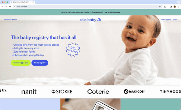
I defined the landing pages design at different breakpoints after the branding was added and before dev handoff.

Personalizing registries
We let users add themes to their public registry links, which we borrowed from our wedding website feature.
This added another delightful offering to our users that others competitors don’t have. We were able to just use our wedding website codebase and adjust it for the singular baby registry page, and we designed the theme selector to fit in the Registry Settings on the app.

Launch outcomes
We successfully launched Zola Baby on September 6, 2023.
We sent an email out to existing Zola wedding users to introduce Baby a week later. Considering there was no other Baby marketing budgeted for the rest of 2023, the app has been off to a great start in terms of signups and dollars added in the first month.
Project reflections
Getting the tone right required brand collaboration
Early in the process of designing the app, we’d get stakeholder feedback that the app was “missing some emotion”. We quickly realized this didn’t have to do with functionality, but with the look and feel, and we advocated for brand design assistance early and often until we got the resourcing we needed.
The most complicated pieces were actually not UX-related
The overall design went fairly smoothly, thanks to an already-mature registry product we could base our flows off of. The complicated parts were actually the backend, lifecycle marketing, and merchandising; for example, making sure Zola users weren’t getting incorrect orders or emails on their Baby or Wedding accounts. Related to the note above, getting stakeholder approval of the more branded experiences was tougher, as leaders were more invested in making the right impression.
Team credits
Product Designer: Casey Bradford, Flo Chan
Product Manager: Jackie McNamara
iOS Engineer: Charles Scalesse, Tony Cheng
FE Web Engineer: Jason Toris
BE Engineer: Felix Lung, Elton Chung, Savid Sharan
Brand Designer: Yi Zhao, Kelly Lipovich
Copywriter: Lauren Davis
Thanks for reading!