
Zola Weddings • Paper Design Customization
Redesigning a mobile editing tool
Optimizing the wedding paper design experience on Zola’s mobile app.

Background
Zola is a wedding startup reinventing the wedding planning experience via its desktop and mobile platforms.
Timeline
Month-long project to redesign the invites and paper customization feature in the Zola iOS app. April-May 2022.
Role
Sole designer working with our mobile product manager and dev team. Cross functional collaboration with web designers and paper business experts.
Skills
Competitive analysis, lo fi design exploration, scalable design, user testing, prototyping
Introduction
Problem
Couples have been able to digitally customize their own invitations and paper items since Zola first launched their paper line. However, the current app experience would not have scaled well enough to support the next phase of design options we were preparing to offer.
Goal
I was tasked with updating the design and scalability of the mobile app paper customization experience to prepare for new offerings coming down the pipeline. Our success metric was to at minimum do no harm, but ideally increase the average order value. The better someone can understand their options (which include upgrades) and complete an order, the higher the value for every user initiating a draft.

The starting point
The previous experience did not scale well
While the existing feature did a fine job of showing the design options available, each element was allocated a specific place on the screen. In its current state, it was hard to imagine how we’d place more options such as colors, QR codes, additional photos, etc.
There was room for a general design refresh
Mobile content creation, formatting, and editing is now generally much more powerful for users than it was a few years ago, so it made sense to reevaluate the existing feature from a design perspective as well.
Some options were available at the top while others appeared at the bottom when tapping on text.
When double tapping text, a new editing experience opened with more options each claiming a specific space around the screen.
Competitive analysis
I observed common patterns from popular content creation tools.
I didn’t limit myself to paper design competitors. Today, mobile users are well-versed in content styling and editing through a variety of native platforms, such as Instagram Stories, iOS Photo, and Canva.
Use universally recognized icons to display styling options
A side scroll menu placed at the bottom of the screen/content
Reveal more options as the user interacts with each element
Grouping our current offerings
I conducted a light card sort to help group and model all our paper offerings.
Zola already offered numerous style and order options for our users, with plenty more to come. For some light and quick research, I asked two coworkers unfamiliar with the paper business to do a card sort of every customization and order option that Zola offers.
Low fidelity screens
To focus feedback on the UX, I started with lo fi designs for stakeholder review.
The paper customization flow is the only tool on Zola using a dark mode UI. Because there’s no supporting system for it, it was easier to get review on the changes in low fidelity first so that I could focus on UI related questions later.
A sampling of screens that underwent a first round of review
Mapping out edge cases
I worked with paper business experts to map out all behavior variations to capture edge cases.
There’s actually a wide variety of card types that can be customized and ordered, including save the dates, menus, and programs. Since some customization options are only available for certain card types or design suites, I needed to make sure that I had considered all scenarios.
Some formatting options can also be applied to multiple elements at once, so it was important to understand what actions were possible to do in bulk.
Iterating on the experience
I worked through multiple iterations of the text styling experience to find the right solution.
The experience when a user taps on a piece of text to edit its font, color, size, etc was the most challenging bit. And because this was the cornerstone of the flow, each iteration needed to be prototyped for stakeholder critiques and user testing.
Option A: Open drawer of options over the preview. This option covered too much of the preview, and we didn’t want to zoom the user around the design if they were editing a piece of text normally covered by the drawer.
Option B: Preview the text on a translucent overlay with the drawer of options. Seemed fairly intuitive, but darker colors were too difficult to see, and sometimes important text on invitations can be small and complex i.e. times and locations.
Option C (winner): Isolate the piece of selected text in a separate full screen takeover. This allows the user to focus on making changes without other distractions. We also implemented a black background toggle so users can easily see changes in colors too close to white.
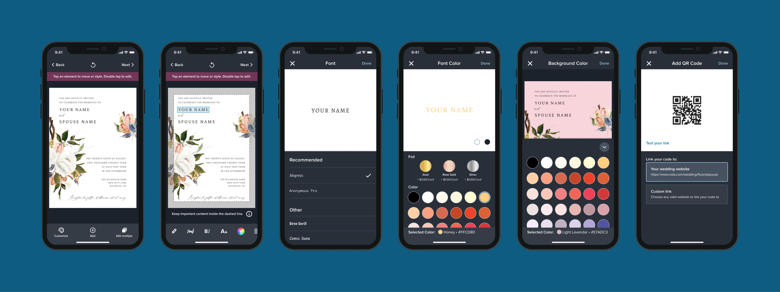
The final design
New toolbars allow for more options, and the select-to-edit experience is more consistent.
In the now released feature, users see a default toolbar with global settings when first arriving in the customization flow. When tapping a piece of text, another toolbar is revealed with style settings. Each style setting opens a full screen takeover with a preview area of the selected text.
Both toolbars allow for more options to be easily added in the future. We also kept the ‘dark mode’ theme for the whole feature for now, though we’ve done explorations on transitioning all screens to light mode for better design consistency with the rest of the app
First launch outcomes
After observing performance for about a month, the average completion rate came in just below the previous flow, but average order value went up. Success!
Moving the ‘Next’ button to the top right from the bottom right of the screen may have impacted step completion. However, it seemed that with a more organized UI, users were finding and adding upgrade options more than before.
Scaling up for offering expansion
It’s now easier to add new options with less effort.
Since the first release in spring 2022, we’ve shipped several new options and upgrades, and the new flow proved suitable for these changes. For example:
July 2022: Add QR codes to back of card
Nov 2022: Card shape and stamped foil expansion
Jan 2023: Back of envelope address printing
Aug 2023: Table numbers (new card category)
and more!
Adding a QR code
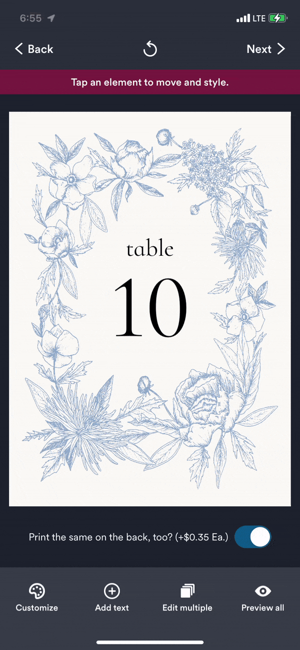
Customizing a table number (new card type)
Project reflections
It’s worth it to question existing paradigms and optimize the resources available
This was one of my first major projects as a PD at Zola. Because I was so new, I hesitated to question certain existing design patterns such as the dark mode theme. In hindsight, we could have included that update with this project to create better design consistency while we had a developer dedicated to it.
Live app testing would have been insightful
If I could do this project over again, I would’ve started with a live user test of the app’s previous experience. While we generally knew the challenges of that UI, user testing would’ve helped prioritize and validate how people were using the feature in general.
Team credits
Product Manager: Michelle Chu
iOS Engineer: Tony Cheng
Business Manager: Allison Stroop, Manika Garg
Thanks for reading!