
Personal project
An app concept for curious home cooks
Designing a product that helps home cooks discover new cuisines

Context
Student capstone project for Springboard UI/UX Design course. Feb 2021 - June 2021
Role
Solo project - user research, UX design, UI design
Tools
Figma, Miro, Google Forms
Skills
User interviews, usability testing, ideation, wireframing, branding, prototyping
Introduction
Problem
Trying new cuisines is rewarding, and even more so now that many are cooking at home. However, finding new recipes can be frustrating. Sometimes people aren’t sure if they have the right ingredients, are too intimidated to make a dish, or just flat out don’t know where to start.
Goal
Create a high fidelity prototype for a recipe mobile app that helps people learn about and cook different cuisines around the world, by incorporating elements of social interaction and gamification.

How might we demystify unfamiliar cuisines, and inspire people to cook something new?
Secondary and market research
I first looked at existing research to learn more about the problem.
Surveys showed that many people’s COVID experience affected their cooking habits: They're cooking meals at home more, and looking for more foods to try.
60%
of consumers said cooking from home was their top change since the pandemic (Food and Health)
45%
of consumers want more inspiration to try new foods (CNBC)
Existing popular recipe apps also aren’t focused on cuisine discovery.
I looked at NYT Cooking, Epicurious, and Yummly and noticed they were focused on providing a big searchable database. This helped me consider how my own would differ from the existing competition.

Interviewing home cooks
What gets someone to try eating or cooking something unfamiliar to them?
Before diving in to any further design or ideation, I wanted to know about users’ goals and motivations - what inspires them to try something new. I interviewed 18 home cooks about their eating and cooking experiences, and then sorted through their responses to find common themes.

Nearly all interview responses on Post It notes

Creating an affinity map helped sort major themes

Example of a theme cluster

Our target users
I created personas to summarize the key characteristics of target users.
Motivated by growth and a sense of achievement
Want to use up the ingredients they have

Key insights from the interviews
Having a social connection
All participants mentioned a social relationship or situation when they last tried a new food - they were influenced by people they know personally.
Starting with familiarity
Participants usually started exploring cuisines similar to what they already knew, then expanded their tastes from there.
Seeing what's important
Participants often had trouble scanning recipes for important information, like diet restrictions or key ingredients.
Defining functionality
I sketched and brainstormed potential features and narrowed down the options.
Based on the research insights, it was clear this app should have both a social and an exploratory component. Interviewees had also mentioned pain points with recipe platforms, which would also be good to address. Ideas included a live video chat option, a way to earn achievements, and other recipe enhancements.


Mapping out the main flows helped me evaluate the feature set.
Creating the site map, user stories, and user flows helped me think through each feature in detail, which let me to reconsider the video chat feature. Would users want to video chat within my app vs other established video clients? Looking back at my research, I realized it wasn’t a good fit, so I explored other ideas.

Map of pages

User stories for the main features

Example of a user flow for discovering a new recipe
Final MVP feature set
Collect badges for each cuisine
Give users a sense of achievement, help them see what they haven’t tried
Friend feed and messaging
Friend activity and recommendations was a prevalent theme of interview research
Set pantry preferences
Lets users know which recipes may be more familiar, based on their pantry items
Visualizing the product
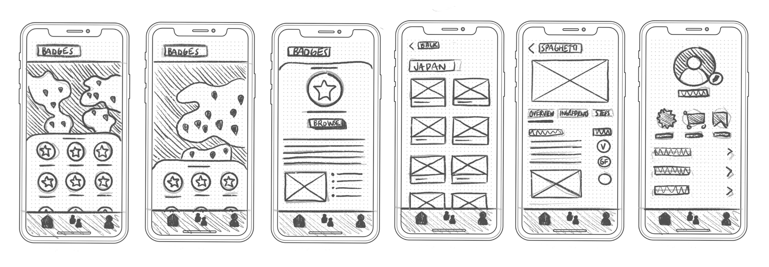
I began sketching out and wireframing the main features of the app.
I created screens for 3 main flows: exploring badges to find a new recipe, sharing a recipe with a friend or on the feed, and adding ingredients to pantry preferences.
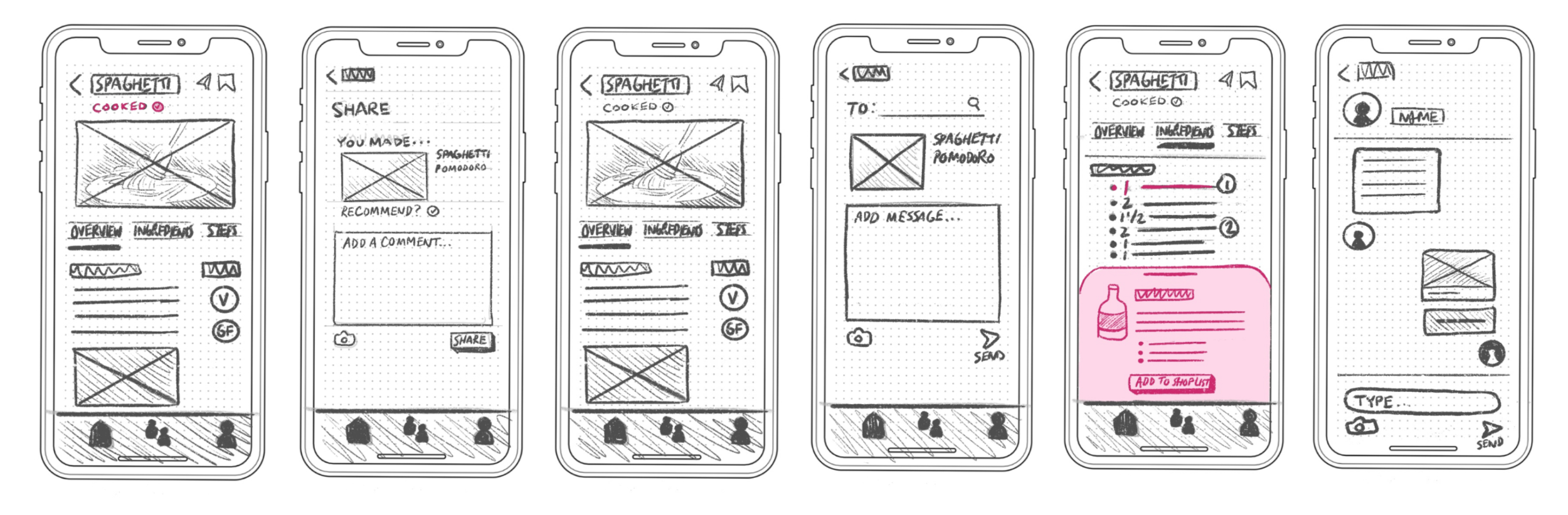
First round of testing
To make sure I was going in the right direction early on, I conducted a usability test.
I asked 5 participants for their impression and to try a couple of tasks. Two key changes resulted from testing.
Some Profile options had too much emphasis.
Users were confusing the certain settings when asked, so I made a standard list with icons, to give each option equal weight.
It was difficult to find the create post option.
A create feed post option lets users compose posts to their activity feed. I’d initially tied that option with a mark as cooked button, which was hard to find, so I surfaced the Post icon to the same screen with a clearly different icon.
Creating a brand identity
Establishing a brand and style guide shepherded my high fidelity designs.
I created a style guide that explained the product’s personality and design elements, such as font, color and imagery
Since recipe apps rely heavily on photographs, the app needed a muted and simple color palette.
The imagery also included a mix of both cooking and travel elements, since the app was about exploration.


Reconsidering the map feature
I thought a map search feature would be interesting, but I discovered usability tradeoffs.
Cuisines aren’t necessarily tied to a specific location or boundary, which map elements best represent. (Think “Mediterranean”, for example.) I decided a map wasn’t the right representation for this app, so I instead went with a progress badge view and full list, with filters.
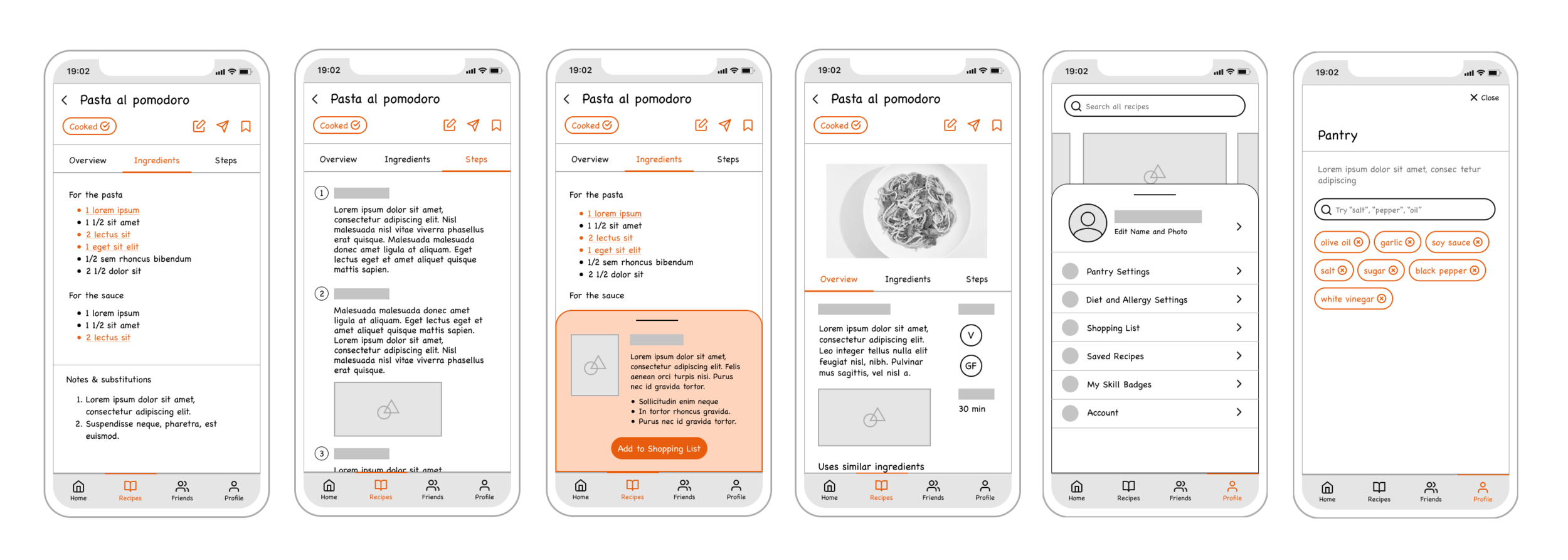
Testing the final prototype
To validate my high fidelity prototype, I ran another task-based test with 10 participants, over 2 rounds. Two major issues were fixed.
The create feed post option didn’t have the right icon
Users thought the pencil icon indicated an Edit function. I changed it to a + icon based on other social media apps.
Pantry Settings chip UI was confusing
Users didn’t feel like it was a permanent setting. Chips felt more like suggestions, and it was also harder to read the longer the list got.
Altered it to a standard list.
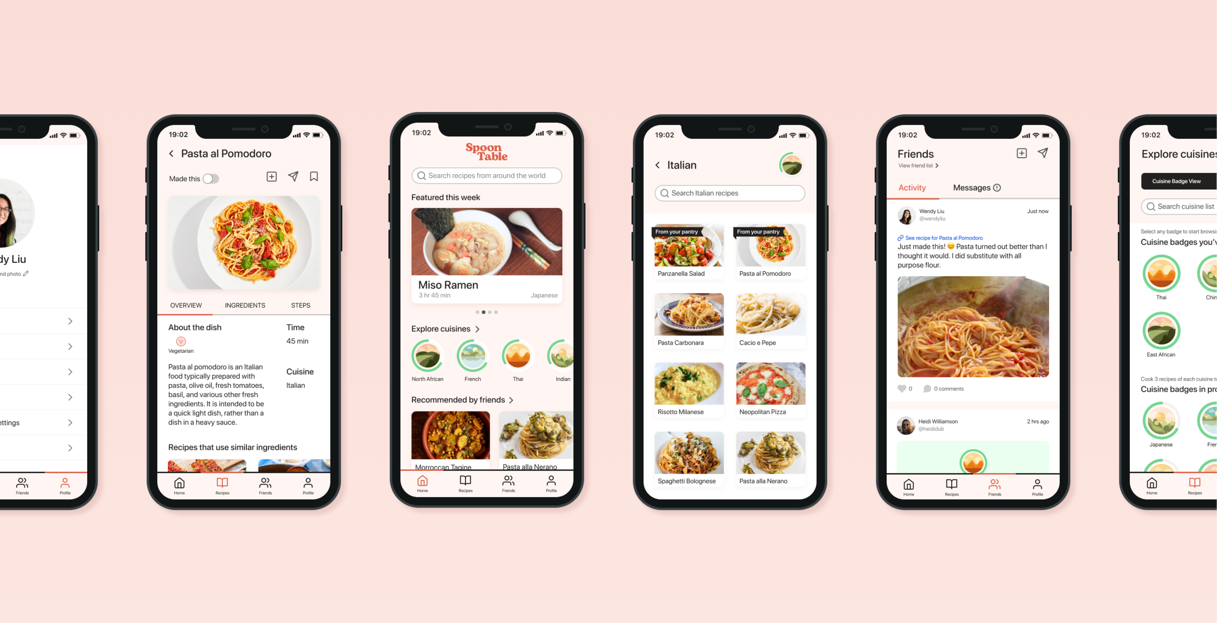
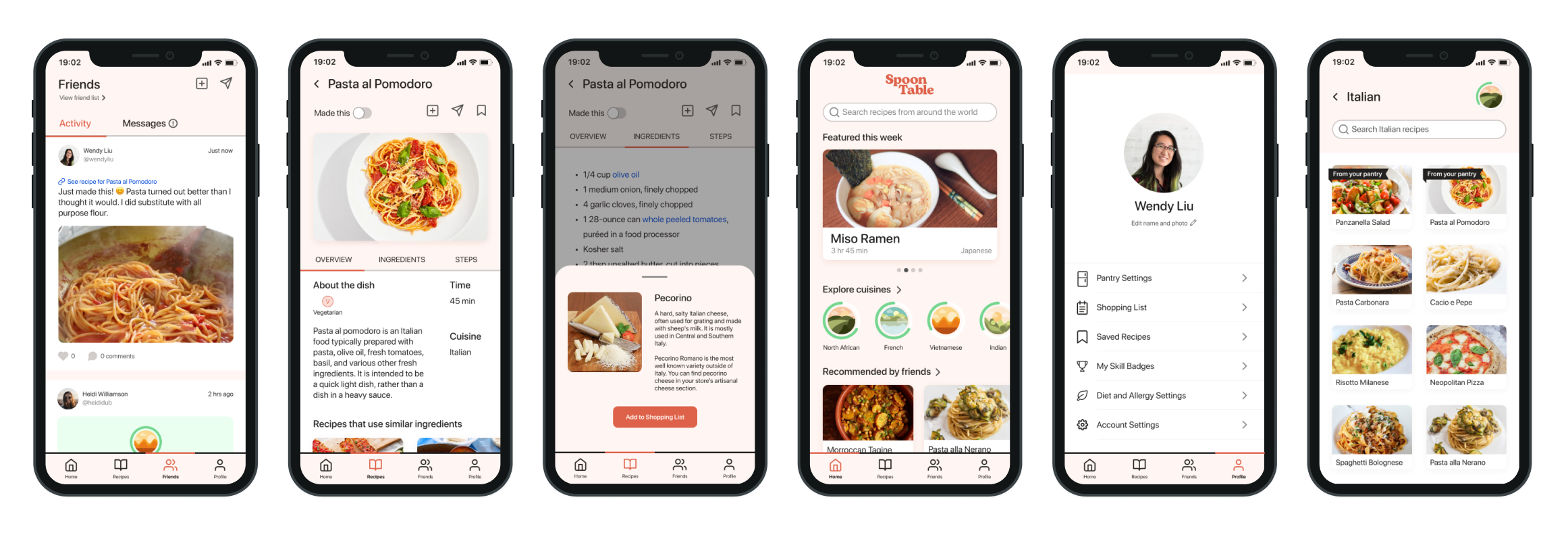
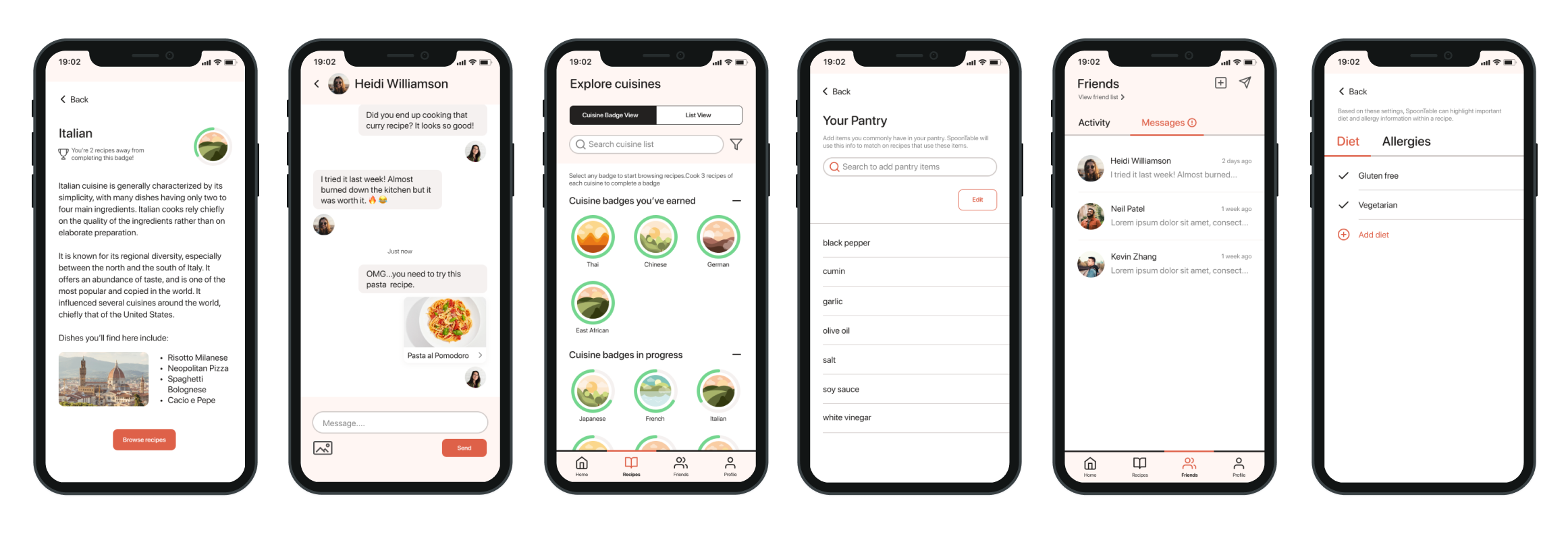
The final design
Exploring badges for recipes
See progress on different cuisines. Review a separate screen about the cuisine to learn more. See recipes from your pantry.
Sharing a recipe to your friend or feed
Send a recipe to a friend, or share it to your feed. Compose your own message or use pre-written suggestions.
Enhanced recipe screen
Three separate sections that are easy to switch between. Select a specific ingredient to learn more and add to shopping list.
Adding to pantry settings
Add and remove ingredients you commonly have in your pantry.

Project reflections
How I’d validate success
Knowing that users were trying and finishing a large variety of badges would be the determining data point for success. If this were a real app, I’d definitely plan to analyze data on how many cuisines each user was on average trying, and how diverse their selection was. A larger, diverse selection would signal success.
Lessons learned
Keep a realistic vision. Even for a hypothetical product, it’s important to consider how it might exist in the market today.
Prioritize ideas that get at the problem I’m solving. The research process alerted me to a wide-ranging list of recipe usability issues, but I had to focus on what was relevant to my problem.
User experience > being fun and unique. An insight I gained while figuring out my issues with a map: While having fun is an important value of my product, it’s not worth a cumbersome or inaccurate experience.
Thanks for reading!